Executive Summary
Nocturne began as a literal dream.
Chef Ruth Landelius imagined an intimate, secret dinner for her inner circle — a one-night collision of East Asian and Latin influences, curated for the Amarillo food community. It was not a restaurant launch. Not a commercial campaign. Not a product.
It was an atmosphere.
Three chefs. No marketing plan. No established visual identity. No precedent in the local scene.
My role was to translate an abstract emotional concept — dreamy, mysterious, romantic, experimental — into a cohesive visual system that could:
Unify three creative personalities
Signal exclusivity without elitism
Feel elevated but not sterile
Scale across social teasers and digital tickets
Introduce the possibility of a recurring branded event
The result was a cinematic, ritual-driven identity system built for intrigue.
The Core Tension
The challenge was not logistics.
The challenge was ambiguity.
The challenge was ambiguity.
“Dreamy” is not a design direction.
“Mysterious” is not a typeface.
“Experimental” is not a layout.
“Mysterious” is not a typeface.
“Experimental” is not a layout.
The chefs aligned emotionally — humor, alter egos, creative risk.
But visually, there was no north star.
But visually, there was no north star.
So before designing assets, I built a structured aesthetic review system.
In the initial style direction deck
First Art Directions for Project
, six distinct tonal territories were presented:
Glitched Prophecy
Post-Religious Punk Zine
Celestial Scrapyard
Black Static
Trash Sermon
Tunnel Vision
Each direction carried defined:
Tone
Visual cues
Typographic traits
Cultural touchpoints
This framework shifted the conversation from “I like this” to:
Does this feel like the face of Nocturne?
That reframing allowed the chefs to make aesthetic decisions with intention rather than instinct.
Art Direction: Dangerous Dream
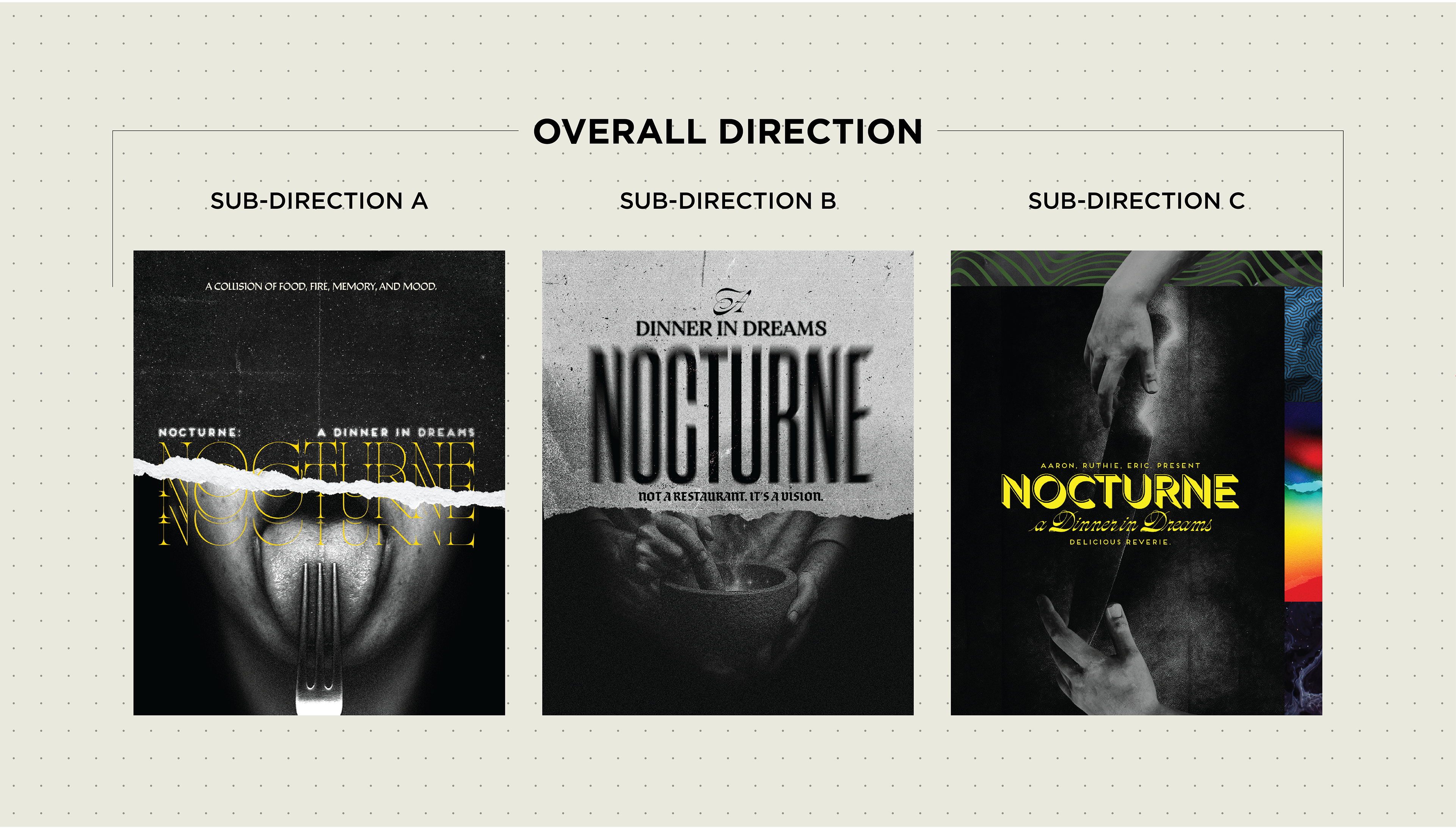
From the six territories, three refined pathways emerged. The strongest emotional throughline became Art Direction 01: Dangerous Dream.
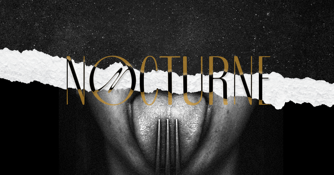
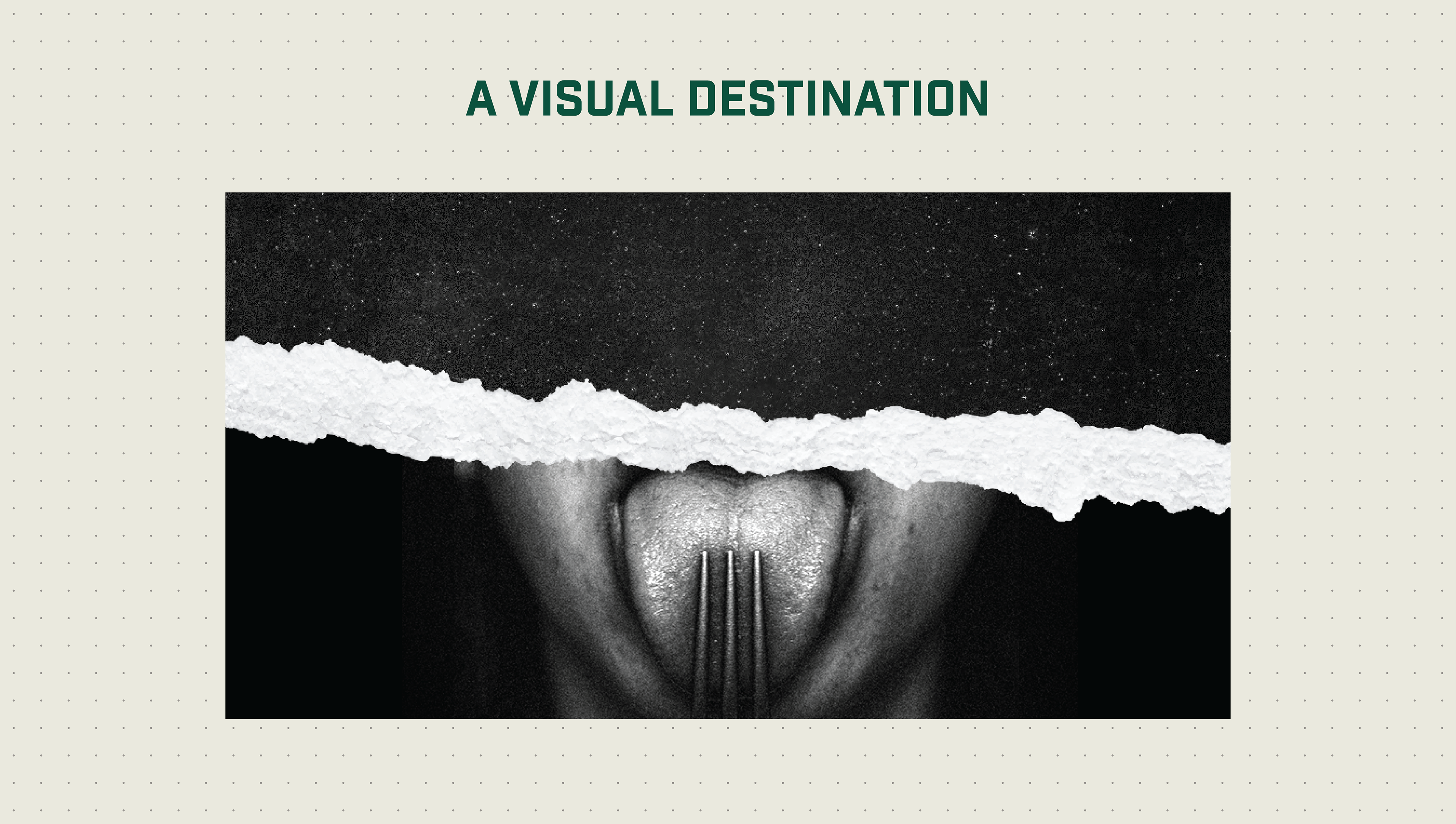
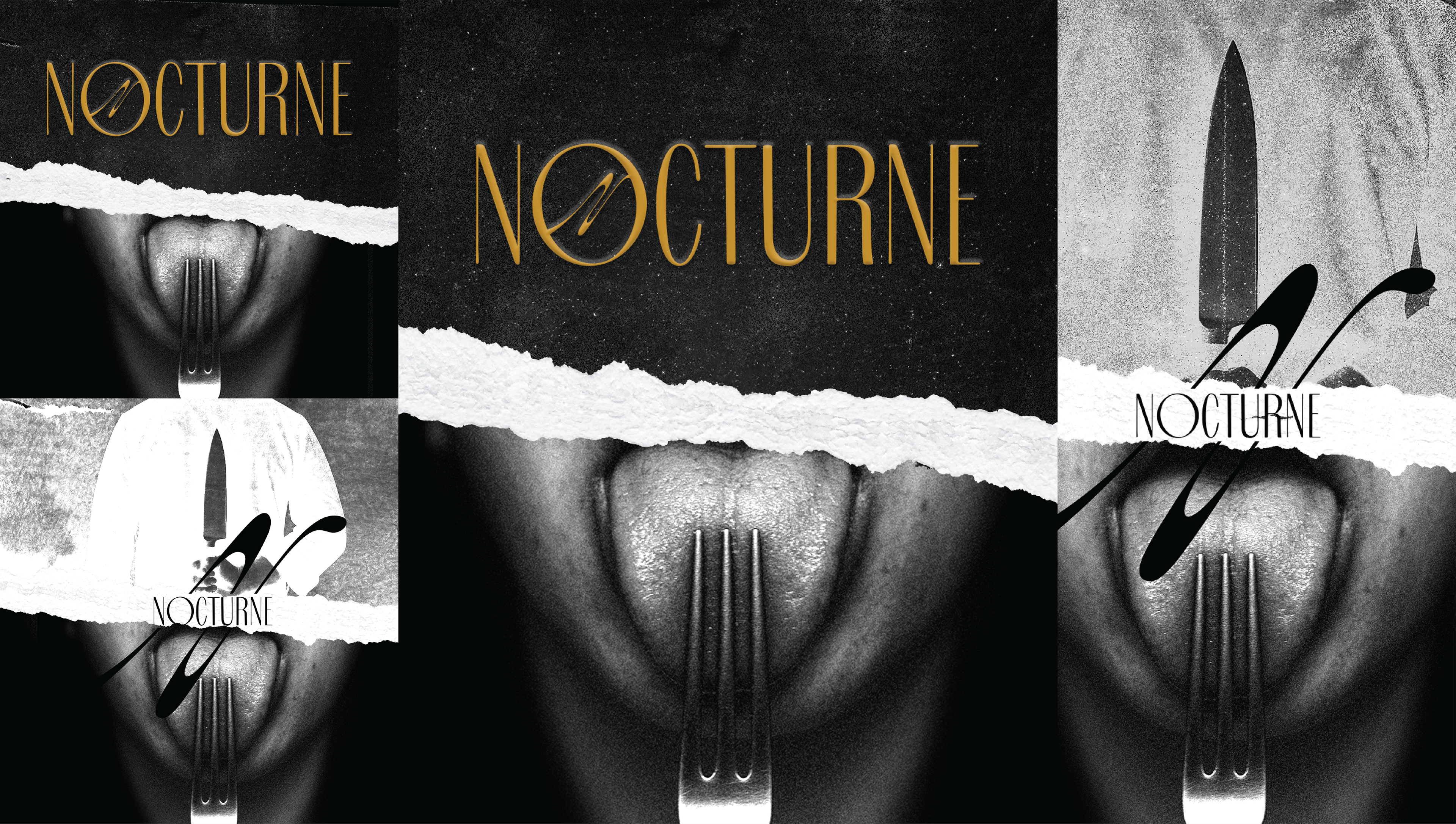
Key elements: The Fork as Totem. A vertical three-pronged fork symbolized the three chefs. Positioned in shadow, it shifted from utensil to ritual object.
The Tear Motif:
A horizontal paper tear bisected the composition — separating the dream state from logistical reality.
A horizontal paper tear bisected the composition — separating the dream state from logistical reality.
Top: atmosphere, reverie, ambient language.
Bottom: date, RSVP, grounded information.
Bottom: date, RSVP, grounded information.
The tear became structural, not decorative. It created a repeatable content architecture for:
Introduction slides:
Chef bios, Teaser drops, Event information posts, The system functioned without sacrificing mood, Visually, the direction balanced: High-fashion editorial restraint. Zine-inspired rupture. Film grain and noise texture. Controlled gold typography. Heavy black fields. It felt cinematic but intimate. Elevated but slightly dangerous.
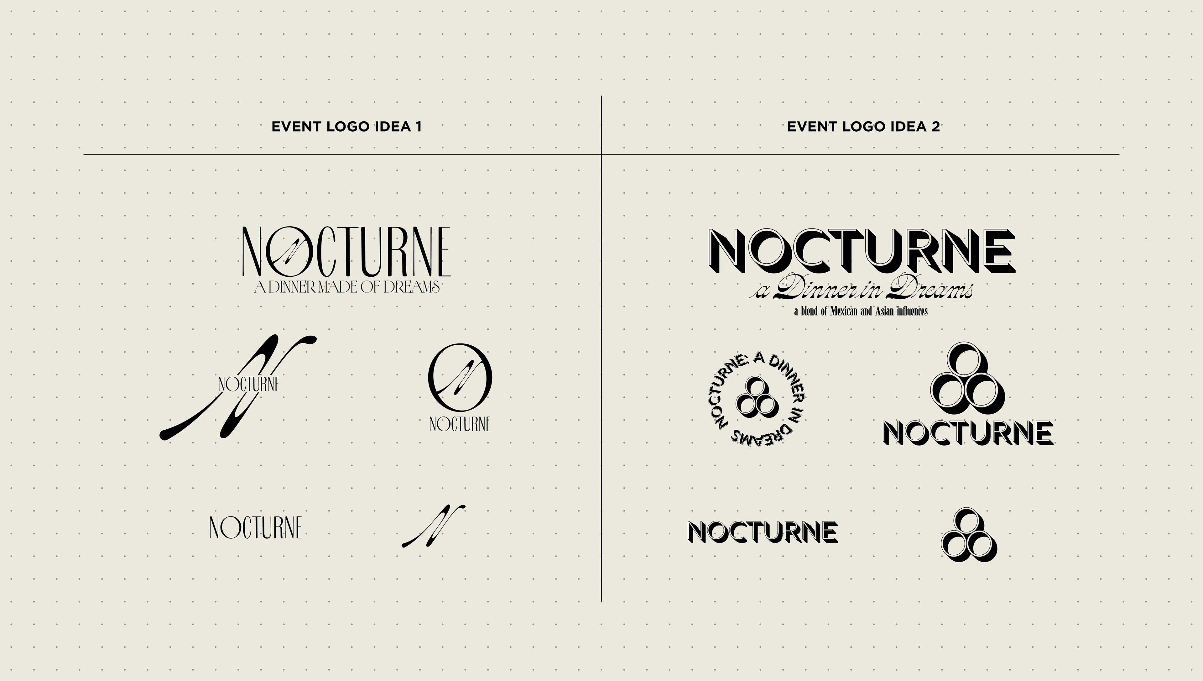
Logo System Strategy
Two primary identity systems were explored
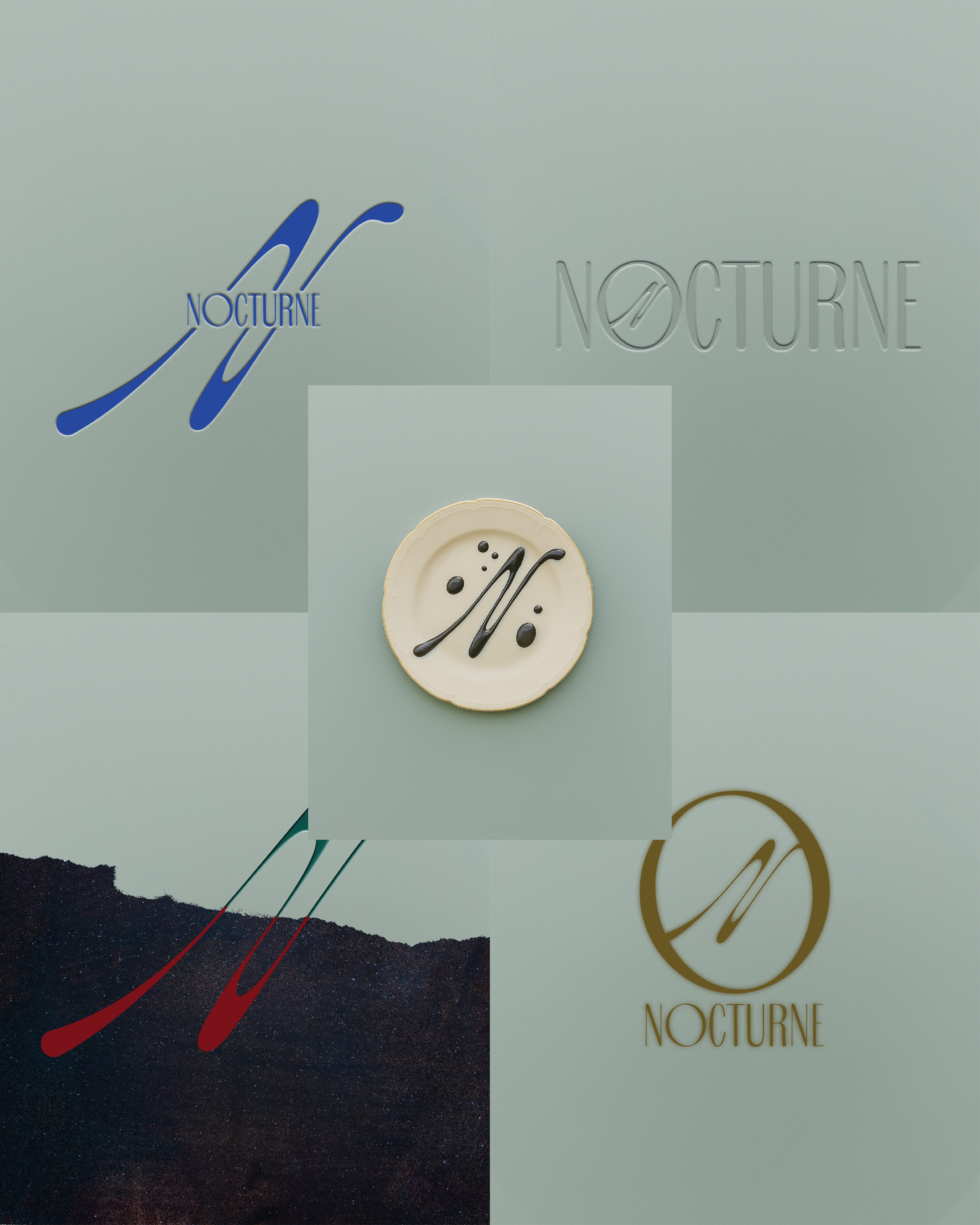
System One: Cult Dining Movement
Tall, narrow serif typography evoked classical performance and fashion editorial tension.
A fluid script “N” monogram introduced gesture and rebellion.
A fluid script “N” monogram introduced gesture and rebellion.
The circular lockup suggested:
A plate
A moon
A portal
The tension between refined letterforms and expressive stroke mirrored the chefs’ duality: disciplined craft and unleashed alter ego.
This system leaned emotional and atmospheric.
System Two: Dream as Brand
A geometric, shadowed sans-serif wordmark with architectural presence.
Three interlocking circles symbolized fusion and sacred geometry.
Three interlocking circles symbolized fusion and sacred geometry.
This direction positioned Nocturne as a scalable event brand rather than a singular experience.
For a secret first-run dinner, the first system carried more volatility — and therefore more energy.
Design Thinking Framework
The project followed five phases:
Abstract Translation
Converting emotional language into measurable visual systems.
Converting emotional language into measurable visual systems.
Alignment Architecture
Creating a decision rubric to unify three creative leaders.
Creating a decision rubric to unify three creative leaders.
Symbol Elevation
Transforming culinary tools into ritual imagery.
Transforming culinary tools into ritual imagery.
Content Container Strategy
Designing adaptable zones for mood vs. information.
Designing adaptable zones for mood vs. information.
Scalability Testing
Ensuring the identity could flex across social, tickets, and future event iterations.
Ensuring the identity could flex across social, tickets, and future event iterations.
Cultural Context
This was not New York or Los Angeles.
This was Amarillo.
A conservative market where experimental dining exists in pockets rather than institutions.
The visual system needed to feel bold without feeling inaccessible.
Intriguing without alienating.
Intriguing without alienating.
The restraint in color, the cinematic darkness, and the disciplined typography allowed the edge to exist without tipping into parody.
PROCESS NOTES
This wasn’t just branding. It was translation work. Ruth trusted me fully. When she calls, I show up. No negotiation. There were budget constraints. There always are. But some projects aren’t transactional. They’re relational. The chefs weren’t asking for a logo.
They were asking for permission to become alter egos. The fork image didn’t happen immediately. It took iterations. At first it was aesthetic. Then it became symbolic. When it shifted into ritual territory, the system locked in. The tear? That was the pivot moment. Without it, the work was mood. With it, the work became architecture.
They were asking for permission to become alter egos. The fork image didn’t happen immediately. It took iterations. At first it was aesthetic. Then it became symbolic. When it shifted into ritual territory, the system locked in. The tear? That was the pivot moment. Without it, the work was mood. With it, the work became architecture.
I’ve learned this:
A brand isn’t built when it looks good. It’s built when it can hold tension. Nocturne holds tension. If Nocturne Returns, the system is designed to evolve into:
Printed menus with torn edge treatments
Wax seal invites using the circular monogram
Limited-run zine-style recap books
Chef jackets with embroidered mark
Small-batch poster drops per dinner
A recurring “Nocturne Series” identity expansion
The foundation is stable enough to scale but volatile enough to stay interesting.
Final Reflection
This wasn’t a logo for a restaurant. It was the first mark of a cult dining movement. And it proved something important: Conceptual design belongs in Amarillo.